Summer Break:
Self-Care by Design
An App for Educators

The problem:
Every teacher in America is exhausted.
In the year since the Covid-19 pandemic began in this country, there has been a parallel epidemic of educator burnout. Teachers are frustrated and overwhelmed. Veteran teachers are retiring in record numbers. Young school counselors are seeking work in other fields. The demands on educators are rising while society’s respect for them is dropping. It is a crisis for each teacher and for the educational system as a whole.
Where the solution begins:
To create an app that encourages and rewards self-care and connection among educators: Summer Break.
My roles:
UX researcher, UX and UI designer- from concept to delivery, this app was my baby.
As a full-time online teacher, I am living the problem first-hand, but I was surprised at how much I learned along the way.
Tools used:
Figma, Optimal Workshop, Miro, Marvel, InVision Studio, UX Folio & Google Suite Tools
Timeline:
Nov 2020-Feb 2021


Context:
I’ve been a teacher and a school counselor for more than 20 years. By the fall of 2020, it was clear that the Covid-19 pandemic had dealt a serious blow to the teaching community. My colleagues were in crisis. Their jobs changed overnight. They had to learn new technology while teaching online and in person at the same time amid a real risk of infection. Their work had become an overwhelming burden.
Parents openly criticized teachers in Facebook groups and at school board meetings. In the hardest-working year of their lives, teachers were called lazy and selfish and they had never been appreciated less. It was a toxic mixture. In a job that never paid well monetarily, but at least it had been fulfilling. No more. Educators began leaving the profession in record numbers. The ones that remained had to work that much harder.


Methods:
Screener survey
Secondary research- Quantitative research
Competitive research
Pre-interview survey
User interviews- Qualitative research
Affinity mapping
Empathy mapping
Creating a persona

Interviews:
I needed to know educators' pain points in order to create a plan to address them. With help from my mentor, I created a list of questions that focused on their emotions.
How are you feeling about:
Your workload for you and your colleagues in school this year?
The teaching plan your building has? (Hybrid, all remote, etc.)
The amount of change and uncertainty about this school year?
The kind and the amount of contact you have with students?
Your use of technology/ use of screens & video?
Safety and security protocols for Covid-19?
Mask-wearing/ compliance with mask-wearing?
The safety of yourself and others this year?
Decision-making in your school or district?
Please give 3 adjectives to describe this school year for you so far.
If you could be totally honest with the parents, students, administrators or colleagues you work with in your school, what would you say to them?
If you had a magic wand and could fix all of the problems and make everything better in your school, what would that look like?
Insights from research:
The situation was worse than I thought.
Every interviewee had 6 of the 8 risk factors for burnout.
ALL of the teachers had 7 out of 8.
60% of them were NOT yet using apps for self-care.
28% said the pandemic has made them more likely to retire early or quit.
Meaning 40-55% of veteran educators.
And 53% of Black educators.


Persona
Based on the interviews, I created the persona of Elsa the Educator. Throughout the entire design and development process I referred back to her again and again.
Process:
I took notes during the five user interviews.
I transferred each idea onto a color-coded sticky note.
I later grouped the notes around central ideas to create my Affinity Map.
From there, I rearranged and summarized the main themes into an Empathy Map.
With these tools, I was able to distill the salient personality, frustrations and context to create a Persona that would guide the rest of my creative process.
Whenever I had a question about a font, a color, a category for the information architecture of the app, I would ask myself...
"What does Elsa need?"

Methods:
How Might We statements
Brainstorming
Journey map- not used in this case
User stories
Information architecture
Site map- not used in this case
User flows
Card sorting- open
How might we prevent burnout in educators and offer them a sense of peace?

Brainstorming & Sketches
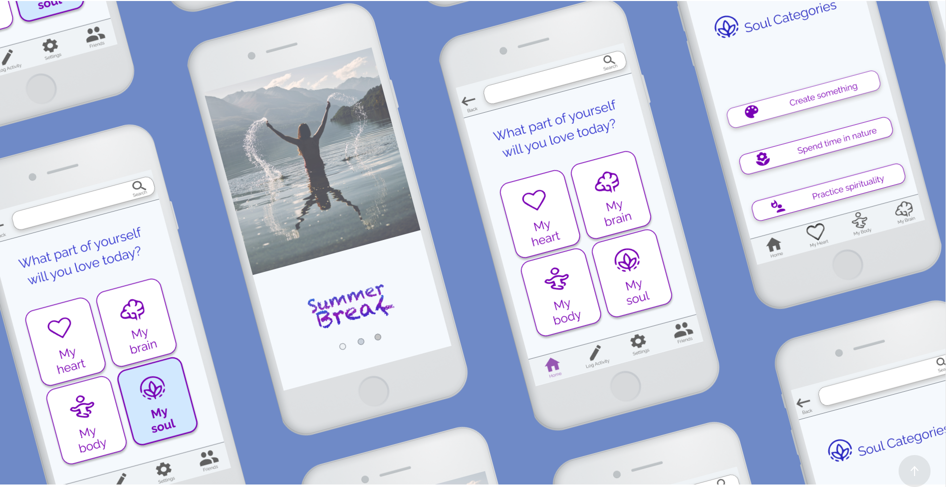
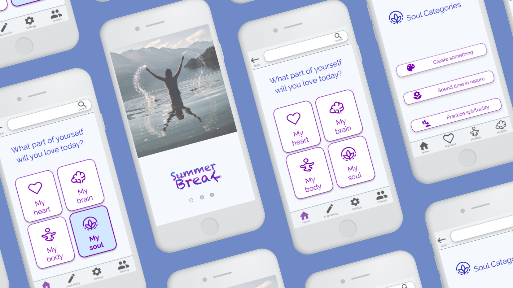
I played with ideas for how to DESIGN AN APP that would allow educators to find calm and relaxation at every click. What do teachers love? Recess? No, too noisy. The Faculty Lounge? No, too much complaining, and too much work to do. Where do they relax? At the beach on SUMMER BREAK. I played with colors of water, sky, sand and the shapes of waves.
My app would offer a list of research-based suggestions for activities that would make them feel good. Users could find great ideas for how to relax and track their moods. They would be able to log their activities and connect with friends through messages, because research shows how our social networks support us. Right away I starting thinking about how I would categorize each activity- by type of activity? By how it made you feel? By what part of yourself you were caring for? I wasn't sure yet. Sketches focused on Elsa at the beach, relaxing, recharging her batteries after a difficult year.

User Flows
I began with simple information architecture and basic user flows for three red routes using Miro.
I first decided to separate the suggested activities into the four categories of Heart, Mind, Body and Soul because I wanted to keep the number of options down, to not overwhelm the user, and they seemed like a delightful and helpful way to categorize a long list of self-care activities.
Later, usability testing showed confusion surrounding the groupings.
Card sorting showed the same confusion. It seemed the categories were not as helpful as I thought they would be.

Card Sorting
I wanted to see how users would categorize the different activity suggestions in the app, so I created an open card sort activity which seven participants completed.
I started with a list of about 60 MPV user stories that were my first priority to put into the app, based on what the persona needed most. Because Elsa needed to relax, I didn't want to overwhelm her with choices on the app, so I needed for the list of categories to be simple.
I created this similarity matrix on OptimalWorkshop.com. I was hoping to find a consensus among the participants on how to group the activities. The more dark blue there is, the more users thought alike about the categories for information architecture.
I found the opposite. Almost none of the participants thought alike. Each created their own groups and their own group names that varied widely.
Conclusion: Virtually NO overlap.

Methods for Design and Creation
UI design principles
Heuristic evaluation of competitive apps
UI elements and behaviors
UI patterns
Material & iOS Guidelines
Mobile first design
Sketching Red Route screens
Low-Fidelity Mock-ups
Wireframes
Wireflows
High-Fidelity Prototypes
Prototype/Test/Iterate/Repeat

Mood Board
My first attempt at creating a mood for my app was the left half of this mood board. It showed a wide range of colors, saturated images with joyful, juvenile, energetic hues and photos. With some guidance from my mentor, I was able to see that this was NOT what Elsa needed. Elsa needed to relax.
The colors that I first chose were happy and ebullient, but the cooler colors of blue, deep purple and teal, as well as the soft, rounded flowing shapes of the UI on the right side of the mood board set a better stage for an app that would relax Elsa all while keeping enough visual contrast to remain ADA accessible/compliant.

Wireframes
At the beginning of my design process I created wireframes using Figma.
Process:
The wireframes allowed me to see the information architecture more clearly- how each screen interacted with each other as the user flowed through.
I was able to see that some of the screens I made had no escape route, so I made sure to put one in, before it would be too costly to do so.
I worked from low fidelity mock up sketches, that I tested with five users through Marvel
Followed by these wireframes on Figma
And on to high fidelity mock-ups that I tested with five users using InVision.
After the first round of InVision testing, I created another iteration of my High Fidelity Mock Ups through Figma, that five more users tested.
There have been four iterations so far.

Evolution of Design
At each iteration, the design for Summer Break becomes more refined and more in line with what Elsa needs. The first guerrilla usability tests through Marvel indicated that users were confused by too many options. The quick turn-around allowed for the wireframe to be clearer and a bit simpler. I created red routes with the wireframes and saw that they could be simpler still. So, by the time I made the high fidelity mock-ups, the space was cleaner.
It was so clean that users couldn’t find how to log an activity.
So, in the latest iteration, because of user needs, I made the “Log an activity” button more obvious and switched up the icons.
UX design, done right, is a perpetual work in progress.


Methods:
Guerrilla usability testing- hand sketches and Marvel
Usability testing of high-fidelity prototype- InVision
Usability testing of iterated hi-fi prototype- Figma
Prototype/Test/Iterate/Repeat
User Testing
I completed three rounds of remote moderated usability testing for the Summer Break mock up and high fidelity prototypes of the app. Guerrilla testing occurred with available friends and family, only one of which was a member of the target group. The next two rounds were all target group members.
Insights
Low fidelity mock up usability testing showed that the screens were too busy, users didn't understand the categories, and everyone thought my picture of a brain looked like a tree.
As a consequence, I switched out from hand-drawn icons to Material Design and Streamline icons and labeled them all. I minimized buttons, pushing several to the footer, and added deep purple coloring.
Round two high fidelity usability prototype testing showed that users still didn't understand the categories and had trouble finding the "Log it" button since it had been moved to the footer. The purple interface and Roboto font got mixed reviews.
Before the next round of testing, I changed the color scheme from stark light gray and purple to a light blue background, and the buttons to outlined in purple, and the font to blue and purple Raleway. I allowed users to find an activity that they liked, and set up pushed button states.
With the most recent iterated high fidelity testing, users wanted to find Meditation under multiple categories "Heart", "Brain," "Body" and "Soul", so I've made a plan to remake every activity findable under every possible logical category in my next iteration- at this stage such a change was not feasible.
Users were finally expressing delight expressing delight more often than not at the prototype. They found the interface simple and intuitive, the colors soothing, and the name and images positive. Several expressed delight at earning badges.
Summer Break is on its way!
Low fidelity mock up for usability testing, round one, made with Marvel.

High Fidelity prototype for usability testing, round two, made with InVision.

Iterated High Fidelity prototype for usability testing, round three, made with Figma.

Takeaways
A UX Designer's job is never done.
Next round, I'll modify the information architecture to allow for cross-listing of activities under different categories.
Colors, fonts, balance and pixels ALL count and allow for the user to either experience delight or confusion.
My colleagues are brave and generous souls, and I could not have done it without them!